Well, I wouldn’t want WIW2D readers to miss out on the fun. Here’s your chance to take sides in an ongoing disagreement between Beefy and myself:
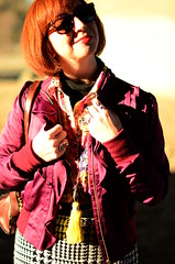
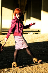
Beefy prefers to take dramatic photos of my outfits in direct, frontal sunlight. He likes the high-contrast results and the way the colors look in the sun. I prefer being lit from the side or back in direct sunlight to better capture the colors and details of the outfit. Complete shade, although boring, provides the truest, clearest outfit photos.
Direct, frontal sunlight can result in good photos, but it takes careful monitoring of the camera settings and my poses to yield usable results. It’s tricky.
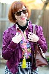
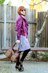
Our first set of photos were shot in direct sunlight with a wide open aperture, but low ISO. Still the light overwhelmed the sensors, resulting in overexposed images with “leaky” edges. I asked that Beefy retake the photos in the shade and he agreed only if I post the original pictures as well and ask my readers which they’d rather see.
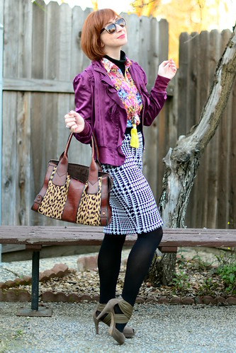
Jacket, Esley. Turtleneck, Mossimo. Blouse, Sans Souci. Skirt, Outlander. Shoes, Libby Edelman. Sunglasses, Betsey Johnson. Necklace pendants, Epcot Morroco (tassel) and thrifted (arrowheads). Bag, Fossil (gift).
I chose a shade photo to lead the entry. Below, are the shade vs sun photos.
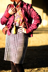
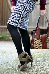

Photos by Beefy Muchacho.
20 comments:
For the record... The house guests agreed with me.
Why not alternate? Kasmira's way of taking the pictures shows off the outfits better, and Beefy's way results in a more interesting-looking picture. Since it's a daily blog, it doesn't hurt to do some photos in the sun and some in the shade.
Your way, for sure. The occasional dramatically-lit photo is lovely, but I prefer to see accurate colors above all else.
Your style, for sure - it gives a more accurate representation of your clothes. I like Beefy's photos if it was a photography blog :)
I know for myself, I much prefer to take pictures in the shade or backlit because I want readers to be able to see what I'm wearing! Beefy style looks more dramatic and can be fun to throw in, but for a style blog where the (ostensible) main idea is to display what you're wearing, Kasmira style is best.
My spouse (who has never seen the blog before) quotes "the photographer should have his photos on his photography portfolio, and the fashion blogger should have her pictures on hers."
We talked about the differences and basically came up with the same reasons you two did for why each set was good. Both strong for different reasons. Kasmira's style shows off the clothes more, and Beefy's style shows off Kasmira more.
Shade for sure. The sun ones actually are a bit unflattering and create shadows that's aren't normally there. Your prettier than that. I've seen you upclose :)
I should be clear that Beefy does take photos in lighting besides direct sunlight. He took today's "retakes" in the shade, too
Definitely riding the fence here! I like both sets of pictures for different reasons! The shade pictures give the best color and definition on the outfits which is why I follow this blog. The full sunlight pictures are just gorgeous, rich, saturated ART.
Without a doubt, "Kasmira" style is MUCH more pleasing to the eye. I was a wedding photographer's assistant and one thing we always looked for was soft light to avoid harsh, deep shadows and overblown highlights.
Your style is way more artistic. It looks like a magazine shoot. Some blogs go for powerful images over "reporting" the outfit. I voted for your style because personally I like it better. But should Kasmira's blog feature your style or hers? The answer to that question is obvious!
I like them both - the shade ones show the outfit better so you need at least one like that, but the other ones are pretty and interesting. So use some of each and maybe you'll both be happy. :)
Beefy's style is aesthetically pleasing and does result in high-drama looks with a lot of light/shadow contrast.
However, I don't want to see the shine on your tights (that's what my eye is drawn to in the 2nd pic), I want to see accurate colour, and the details of your outfit.
Fashion photography has a practical aspect as well as an artistic one: the viewer needs to see the details of pattern and texture as well as the correct colour.
Sorry, Beefy, she's right. :)
I like Beefy's direct-sunlight style (the photos are beautiful) but I prefer your shade photos for a fashion blog. I prefer to see crisp photos of the outfits with clear colors.
I prefer the pics taken in the shade by far. I like being able to see the true colors and the details.
I like them both!! One style shows more of the true color and detail, but I love the dramatic effect of the other.
Sorry Beefy! But this is a style blog, and for it to work, readers need to see an accurate picture of the outfit.
Also? I like this outfit! Very fun, in the sun and shade :)
The super blown-out highlights and high saturation of Beefy's images bother me when I am trying to get an accurate idea of what your outfits look like. Your skin color should not be so blown out as to blend into the white sky.
If this were a blog featuring photography styles, not personal fashion, I would be fine with seeing Beefy's images. As a portrait photographer myself, properly exposed images in the shade or on overcast days provide for the loveliest portraits.
A few images in the "Beefy style" would be fine, but I want to see the outfit accurately, not cross-processed slide film.
I love your hair in Beefy's photos, and they're very dramatic and appealing in a different way.
That said...I come here to admire your awesome outfits. Kasmira style better meets the stated purpose of your blog, from your about page- a photo blog to chronicle what you wear.
-Jen
Your set of pictures definitely provides the better view of the outfit. One exception however is when it comes to tights. Direct (sun)light is definitely better to show off shiny tights / texture/colour/design of your tights.
Post a Comment